I am taking a slight detour in this post because I have been studying like mad for the Excel Expert exam. In the process, I have been reminded of a cool feature that was added in Excel 2013. If you are using Excel 2013 or 2016, try out the Recommended Chart feature.
In this era of data visualization, finding new ways to show your data is a great way to keep your presentations and reports interesting. But how do you figure out which type of chart(s) would work (other than your tried-and-true choice)? This is where the Recommended Chart feature shines. Once you have selected your data, choose Insert> Recommended Chart.
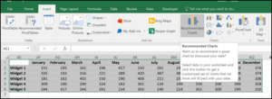
– Choose the Recommended Chart menu option
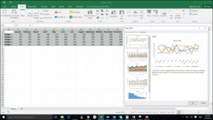
From here, you will see several choices that suit your particular data set:
– There are five different recommended options for this data set
Look carefully at each suggested chart to see if it is a new way of presenting your data. Don’t worry about the colors–you can always change those once you have selected the chart type. Here are some criteria to use when selecting a chart type:
Do you have to add explanations to the chart? If yes, the chart type is too complex.
Is the data ethically presented? Don’t mislead your audience by using a chart type that distorts the data.
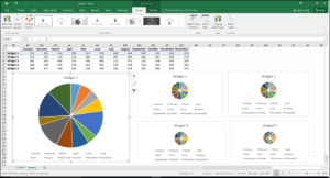
Does the chart type marry well with the type of data? For example, a pie chart is not the best choice for data that is time based. I have created charts with my dummy data set, measuring sales of Widgets across the months of a year. Pie charts are limited to one series of data, so you can’t compare the sales of Widget 1 to Widget 3 easily.
Try to compare the sales of Widget 1 to those of Widget 3
Finally, and most importantly, do you understand the chart? A good chart presents a perspective on the data that you want to communicate. It has to be the picture that represents your 1000 words!
When you get ten spare minutes, take some data that you thoroughly understand and create different charts out of it. You may be surprised by some of the insights you get using different visualizations.