

If you have been building reports for a while, and you have an aesthetic sense (which I freely admit I do not), you may have been annoyed by the header space on the top of each visual. If you don’t know what I am talking about, here’s a sample:
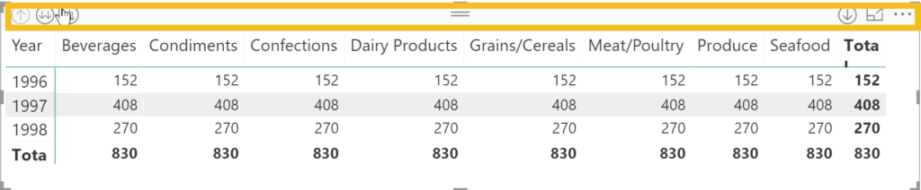
Yes, there were helpful buttons and features captured there, but the presence of the header prevented easy visual alignment with other page elements, such as other visuals or the top of the page.
Good news! In the July 2018 update, you can make this header disappear. Here’s how.
(Make sure you have downloaded the July 2018 version of the desktop. Everything below is premised on you having done so.)
In new Power BI files, created on the July 2018 desktop, this feature will be enabled automatically. But what about all of the files you already created?
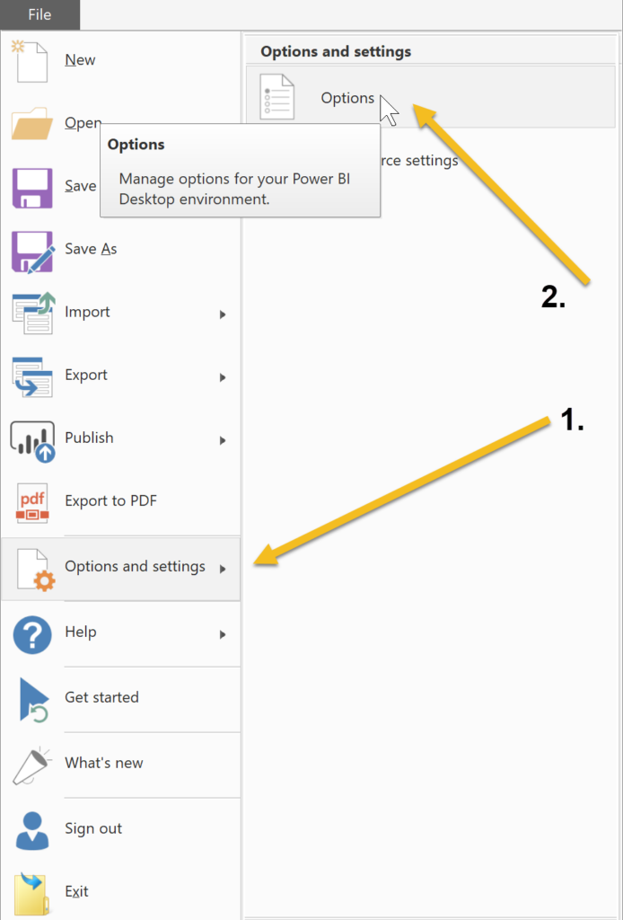
Simple. Go to File, and then Options and Settings. Next, choose Options.
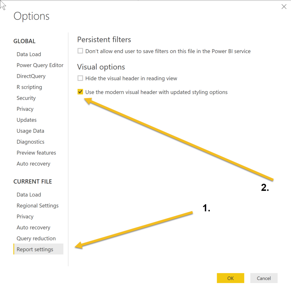
In Report Settings, make sure the check box next to the “…modern visual header…” option is selected.
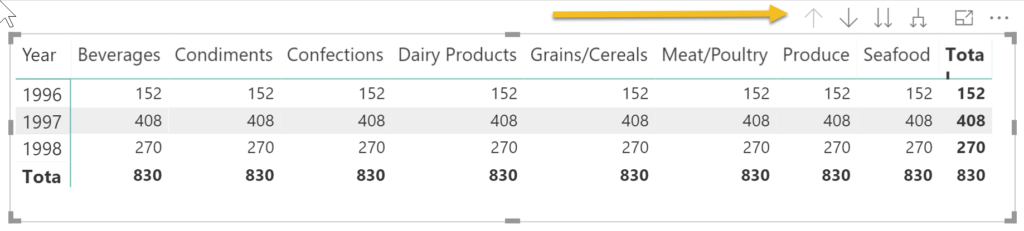
That’s it. Here’s what your visual will look like if you select it:
And if you don’t select it….

Here’s one weird thing about this new feature. Sometimes it will put the controls at the bottom of the visual, as illustrated here:
I am not a very aesthetically sensitive person but this improvement to visuals has pleased me. The top border used to bug me!