

This post is a tale of three arrows. When you create a visual in Power BI, you are frequently using multiple layers of data — think Year, Quarter, Month, Day as an example. Being able to access the ‘lower’ levels of the data is critical to the effectiveness of the visual. So let’s explore your options. (Note: I am using a publicly available data set called Northwind, on the Microsoft site.)
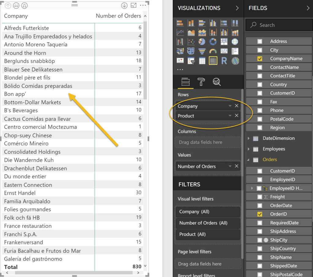
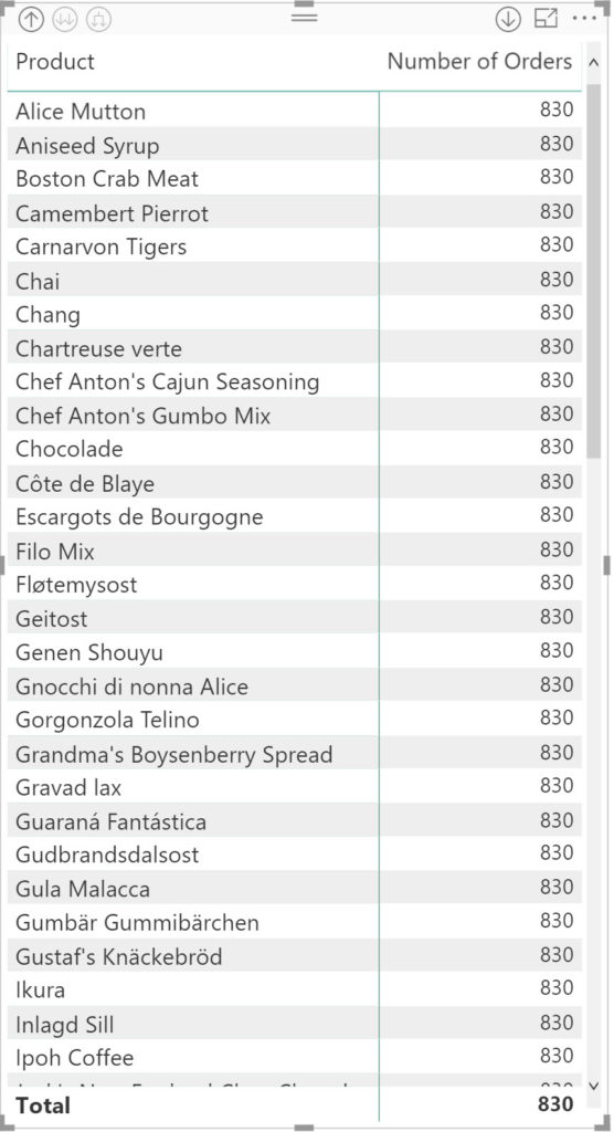
Here you can see that in this matrix visual, we have two layers of data: company and product. Initially, only the ‘top’ layer is visible in the matrix.
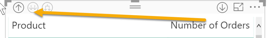
Cue the first arrow, which I like to call ‘the trident’.
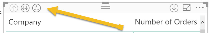
If you click on the this icon (which is at the top of the visual), it will enable you to drill down and see both the company and product.
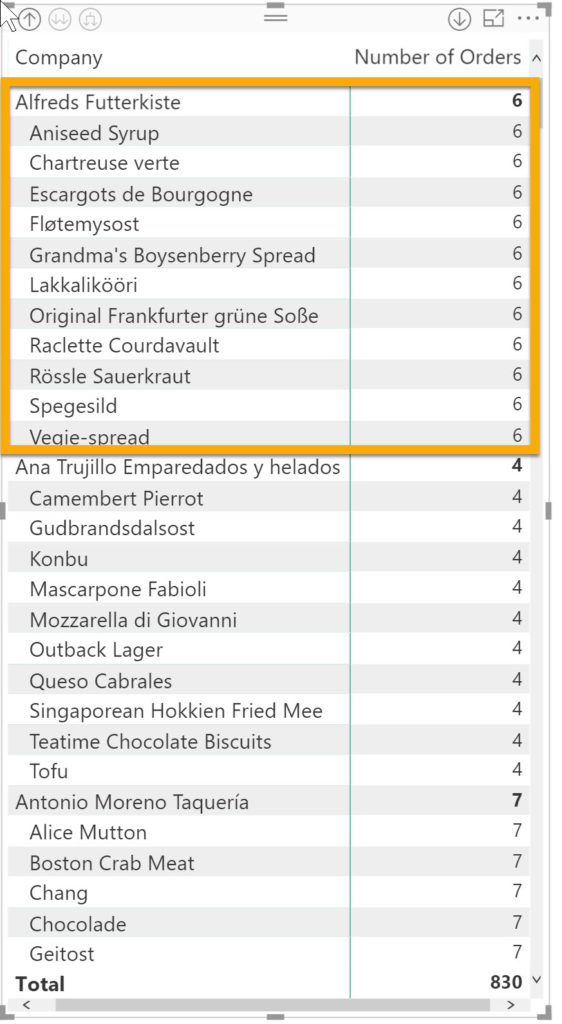
If we had more layers we could keep using ‘the trident’ to make those layers visible.
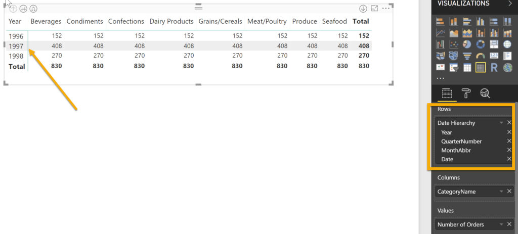
Cue the 2nd arrow button, which I call the ‘double-headed arrow’:
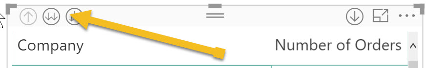
When I click on the double headed arrow I see this:
And where is the third arrow? That’s the “up” arrow.
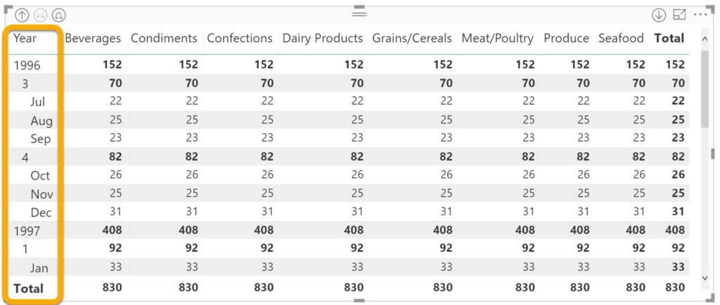
Dates are one form of layers of data that rarely work well with the double headed arrow option. Here’s an example (using the same Northwind data set) where I am using a date hierarchy.
In the screen shot above, you can see that the top layer (year) is the only one visible in the visual right now. If we use our ‘trident’ button, we will see the year, the quarter number, and the month. (I could have gone as far as date, but that’s too much detail.)
Now let’s look at what happens when we drill down using the ‘double arrows’.
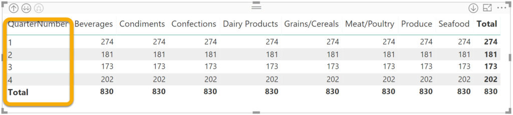
When you use the double headed arrow, you see the next layer in the hierarchy, independent of the layer above it. In this example, we see the quarter, disassociated from the year. When you are looking at dates, it is rare that this behaviour would be desirable. The example I can think of is that you might want to see if a trend is specific to a period of time (e.g. quarter or month), regardless of the year. Think seasonality trends.
So that’s the tale of our three arrows. See you again soon for more BI for Beginners.