
When is profiling ok? When (and only when) it is Column Profiling in Power BI of course!

How many times have you gone into the Power Query Editor (PQE), and wished that you could have greater insights into what is in each column? Remember, PQE doesn’t allow you to see all of the data in the query. It shows you a preview of the data, because it is only storing the query (a link back to the source data) not the actual data itself.
But as they do every month, the Power BI team has delivered a gem of a feature which I just saw today. I loved it so I had to immediately share it with you, dear reader! As you probably surmised, it is called Column Profiling.
Your first step is to make sure you have the latest (October 2018) Power BI desktop. (The desktop is updated every month.)
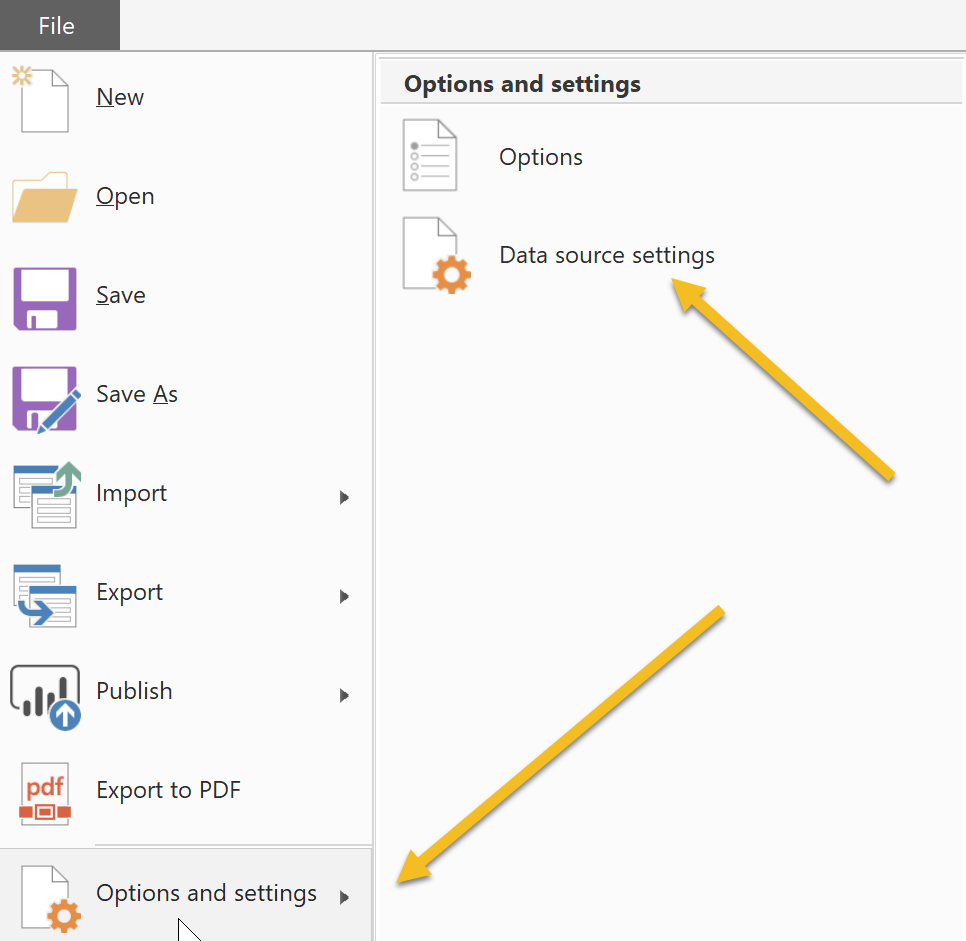
Next, this is a feature that is still in Preview that you have to turn on. So let’s do that. Go to File, choose Options & Settings, and then Data Source Settings (as shown below).
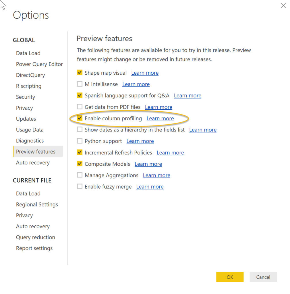
Next, turn on the Column Profiling feature in the Preview features section, as shown below.
Now we are ready to go!
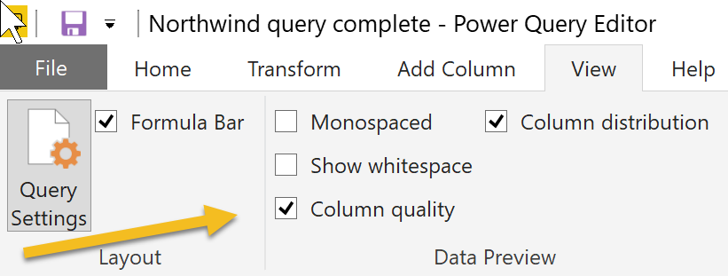
Open up a PBIX file into which you have already loaded data. From there, on the Home tab, choose Edit Queries to open the PQE. Once in the PQE, navigate to the View tab, and check the Column distribution box.
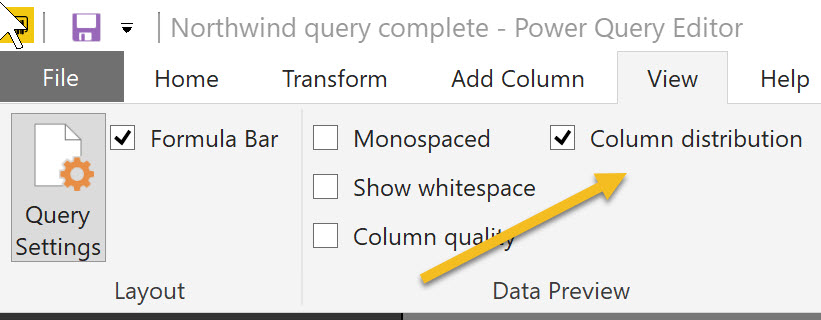 Check the Column Distribution box
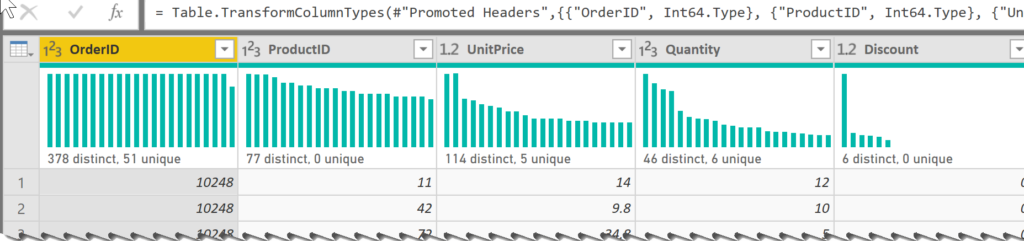
Now go back to the Home tab, and you will see the distribution profiles for each column.
But wait! There’s more! Let’s go back to the View tab, and turn on the Column quality feature.
Go back to your Home tab, and look at the headers above your columns.
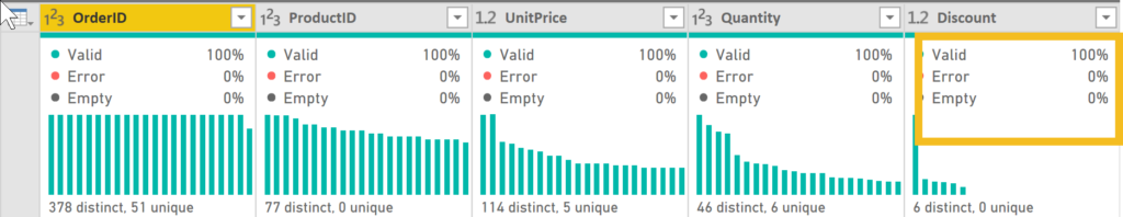
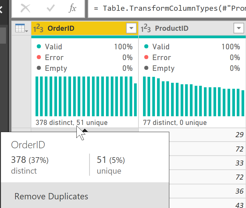
No more scrolling down to look at a subset of your data to assess how ‘clean’ the data are. And if you click on one of the individual profile cards, you get even more information about your data, as shown below.
This feature really appeals to me because it addresses one of my insecurities when using Power BI. I am used to scrolling down in Excel and eyeballing my data. Now I can get an accurate assessment of my data, handily placed at the top of each column. After all, eyeballing is not an exact science!